
With strong skills in logical thinking and system visualization, my expertise lies in addressing complex user problems and developing contextual solutions. I adapt well to diverse teams and communicate effectively in different languages because of extensive cross-cultural experience,.
Final project
Repay+
Repay+ is a one-stop integrated repayment platform.
It aims to simplify the process of paying off loan with a phone app.
Repay+ makes sure the young adults can easily and clearly control their loans and repayments.
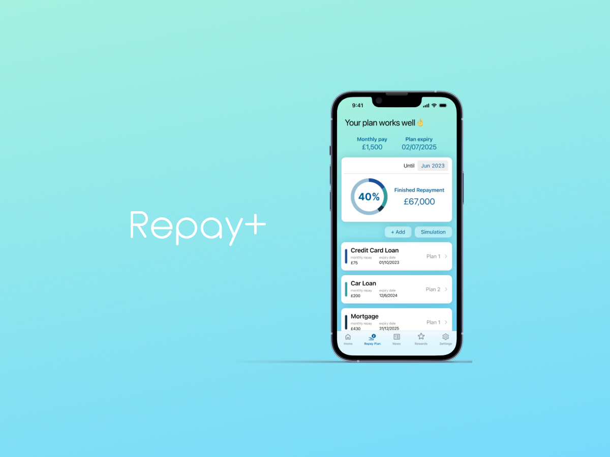

As for the worries about the long-term journey of repayment, Repay+ want to make young adults pay off their loans by achieving multiple short-term target. By making every repayment easier to reach, young adults can be more motivated and confident to pay off.
Young adults usually focus on how much they still need to repay rather than how much they have already paid off. Besides, the unknown future progress can also make them anxious.
Repay+ can show the repaid amount in different stages of progress, empower the user to clarify how their journey will finish, which brings them confidence about their loans.
The huge repayment differences between various loans are challenging for young adults who have multiple loans, especially if they are busy earning more money or running their families.
Repay+ integrates all the repayments in one go. They don’t have to repay in various ways with various access and repeat every month.
Transfer your total repayment once, then Repay+ helps you to complete every single repayment for different creditors.
Simple and time-saving.
It is also complex but important to update the financial news so that the user can take instant action to adjust their repayments.
But the information can be too much and the user may be too busy to keep action it.
Hence, the AI tech of Repay+ can filter the news related to your loan and inform young adults as long as it would affect the repayment.
Moreover, it could provide suggestions for adjustment so that they can change their plan appropriately and instantly.

RESEARCH
Issue: The mental impact of loans
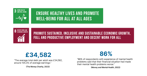
Study, car, house, credit card. Nowadays, loans have became essential for almost everyone.
The data shows that the average loan of each adult is rising to £34,582.
But, people often ignore that the stress of loan can also enhance the negative effect of their mental health. This is the problem we need to handle today
Primary research
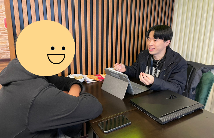
I have interviewed a total of five participants, two of them were my potential users and the other were senior with more experience of paying off their loans.
Potential users could provide me with their concerns about their paying off plan as the possible insights, while senior users could give me more experience and mindset change, inspiring more possibilities for the project.
I used recording software and transcript tools to help me thoroughly review the interview for analysis afterward.
Analysis – affinity diagram
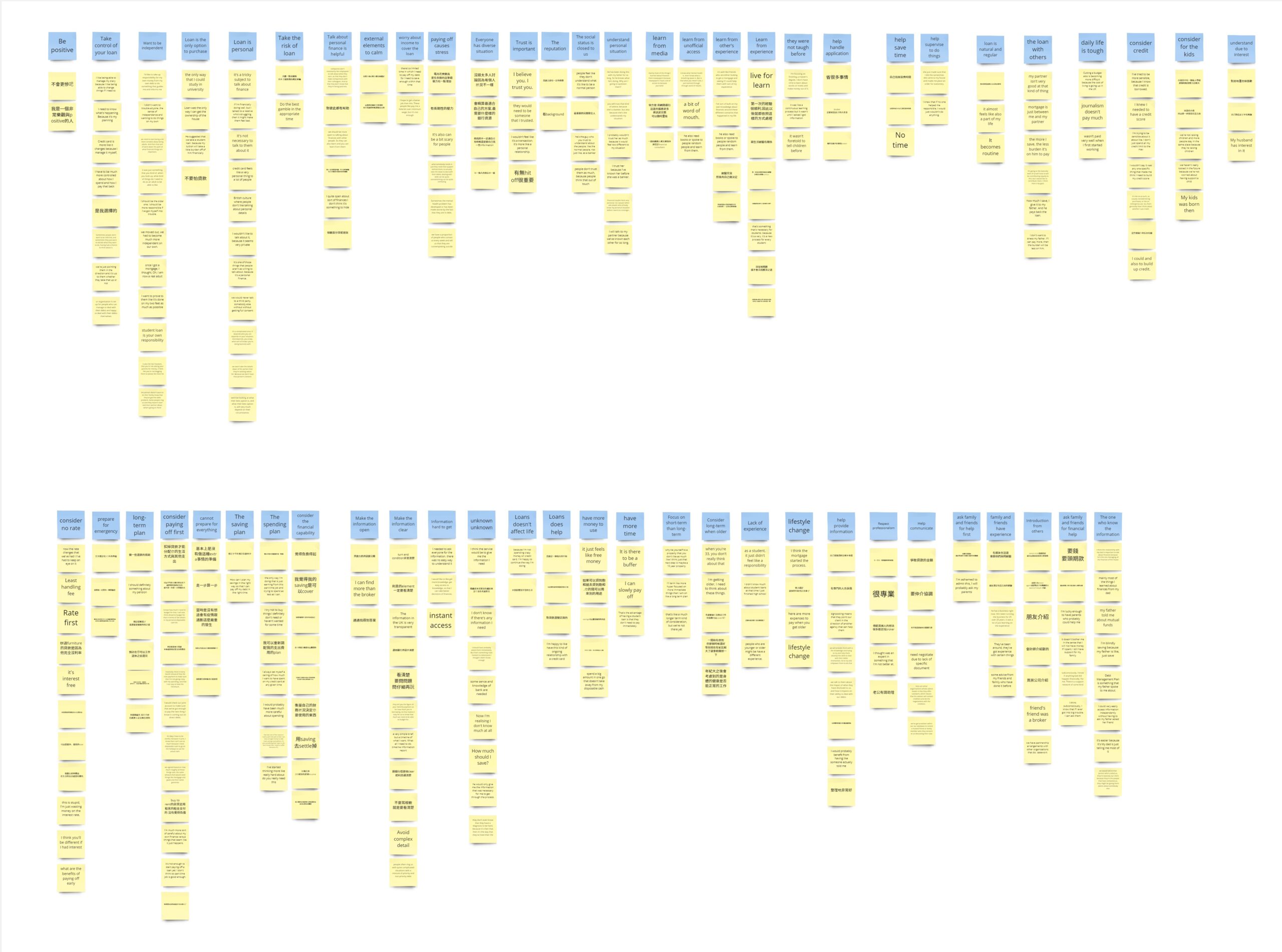
I primarily utilised affinity diagrams for analysis because organising the data without categories initially allowed for innovative insights and prevented excessive personal assumptions.
Analysis – concept map
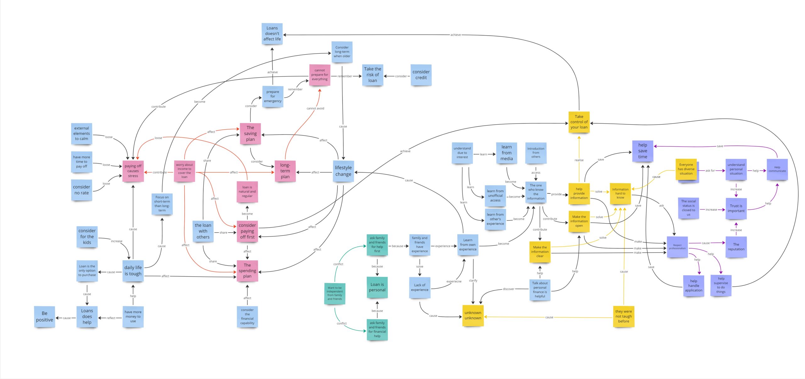
Following the affinity diagram, I employed a concept map to establish intricate connections among groups of quotes. This approach enabled me to extract systematic insights from a specific part of the map.

RESEARCH RESULTS
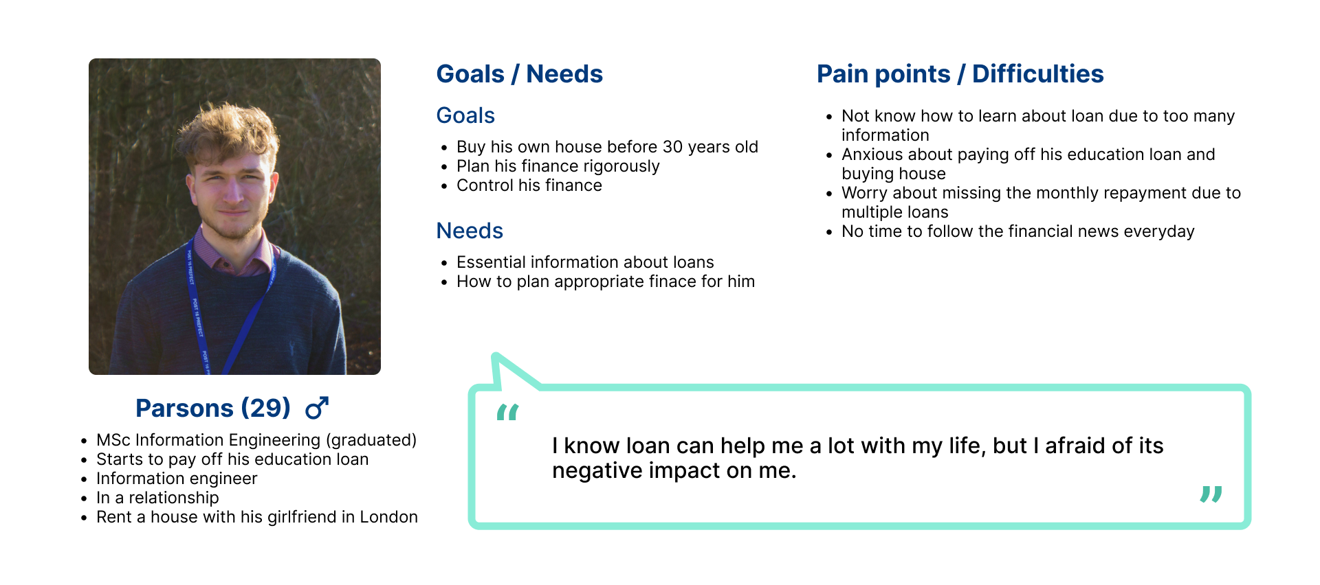
Insight 1
HMW associate the family with the expert to increase both trust and profession
Insight 2
HMW leverages other’s experience to assist young adults
Insight 3
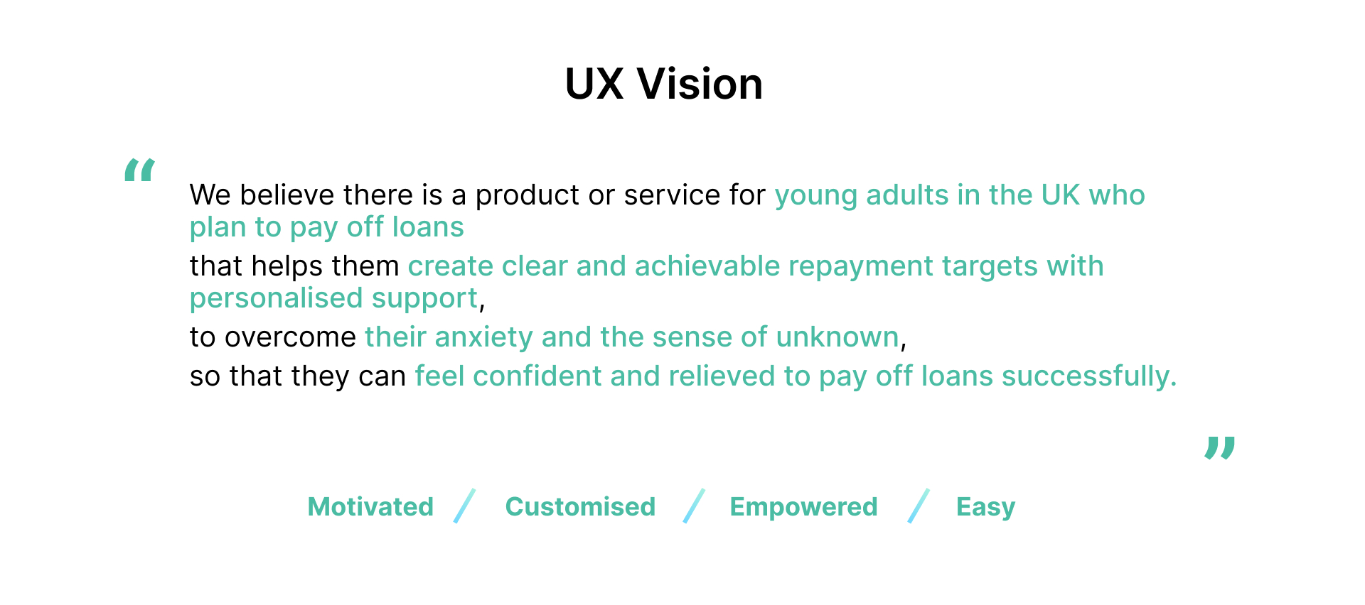
HMW help young adults plan clear and achievable targets to pay off

IDEATION
Co-design
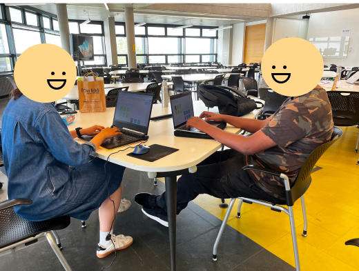
In this stage, I held two co-design workshops. 2 participants in each one and with different identity due to diverse point of view.
The workshops provided me with more ideas to assess my ideas.
As for reflection, next time I want to propose some of my ideas to them and get some feedback before developing them into exact functions.
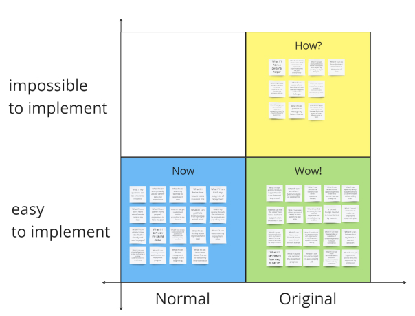
NowHowWow
HowNowWow gave me an initial filter of my ideas.
To present an original ideas, my assessment could mainly focus on WOW or consider the availability of HOW without taking Now into account.
This category also show an interesting observation when assessing with matrix.
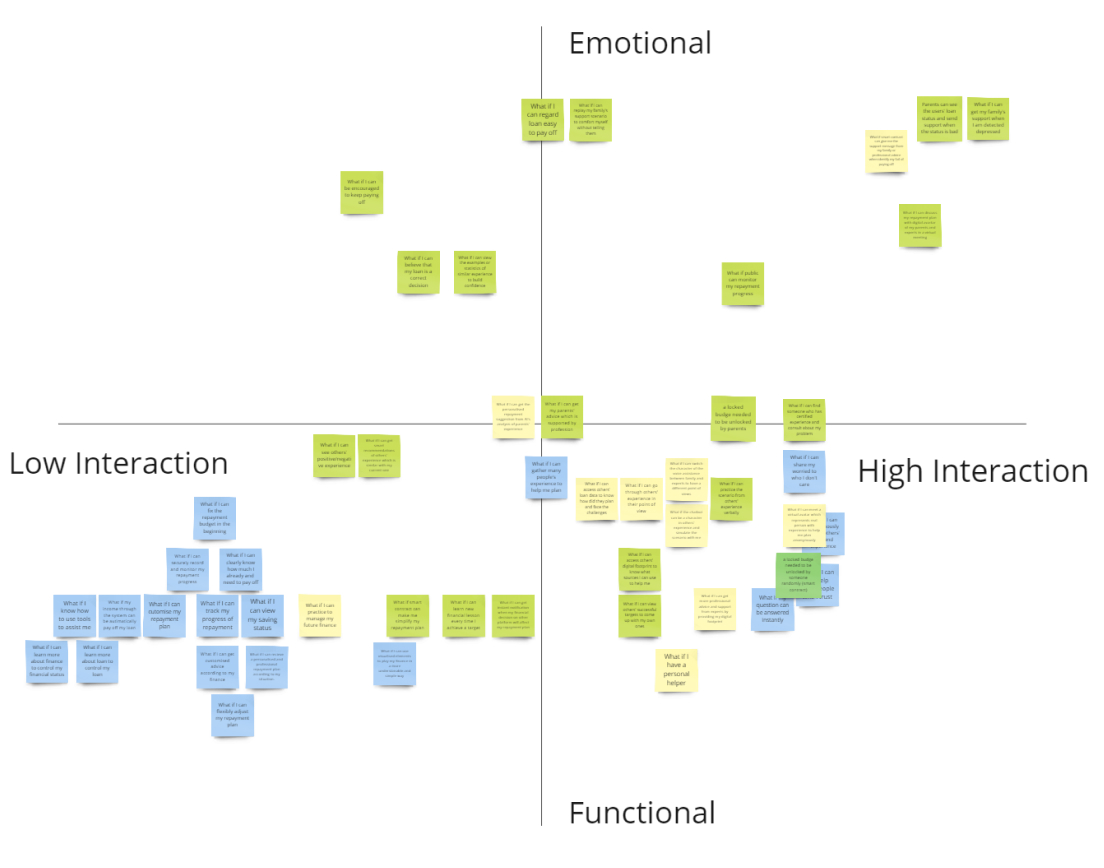
Matrix
When using matrix to assess, I wanted to filter those Wow or How more interactive and emotional due to my project target.
During the process, I accidently found that most of those normal ideas were both functional and less interactive.
I then regard it as my market position..

USER TESTING
User journey map
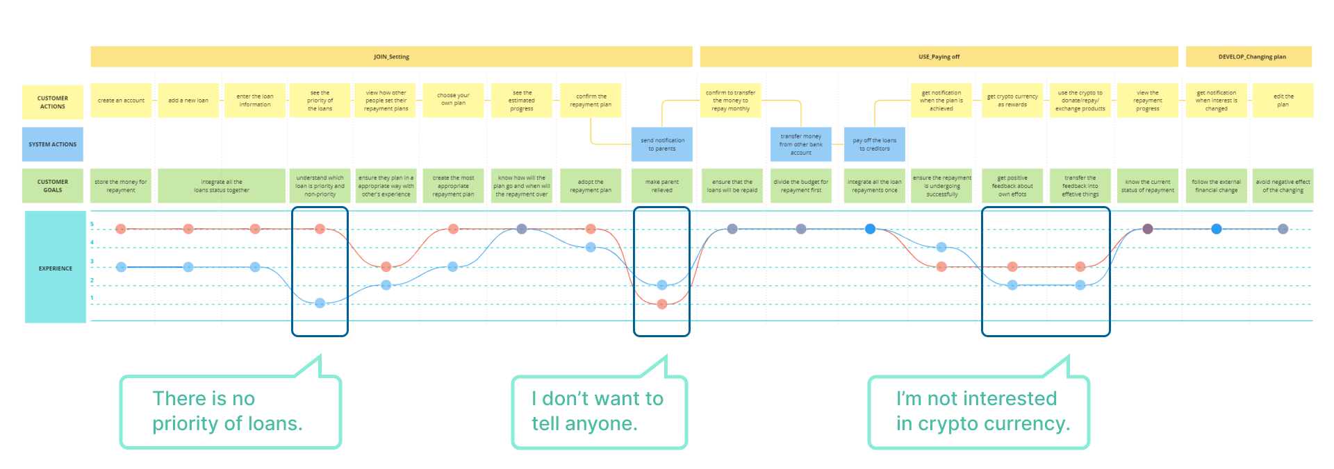
During the test, I employed a user journey map and requested participants to indicate their emotions at each stage. Through the map, they could swiftly grasp the experience and foster empathy.
Furthermore, it facilitated the identification of stages that generated more confusion, enabling the exploration of underlying causes.
For instance, family notification was a significant feature that elicited adverse reactions from both participants. Thus, it became evident that I had misconstrued their family-related needs.
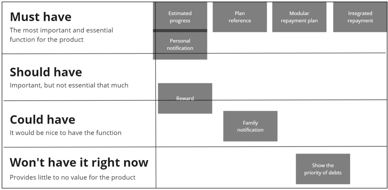
MoSCoW
In the final phase, I segmented the experience into distinct features and employed the MoSCoW matrix to gauge their respective priorities. I adopted this approach as I recognized that occasionally I might place greater emphasis on a feature that the users might not find appealing.
By doing so, I gained insights into their genuine preferences, enabling me to refine my proposal introduction accordingly. For instance, while I deemed these two features pivotal for development, they perceived them as less significant.
Microsoft product reaction card
I also employed Microsoft product reaction cards to have them describe their primary emotions toward the experience. This tool comprehensively encompassed various emotions, and the outcomes aided me in refining and clarifying the most fitting design principles for my project.

Visual preference
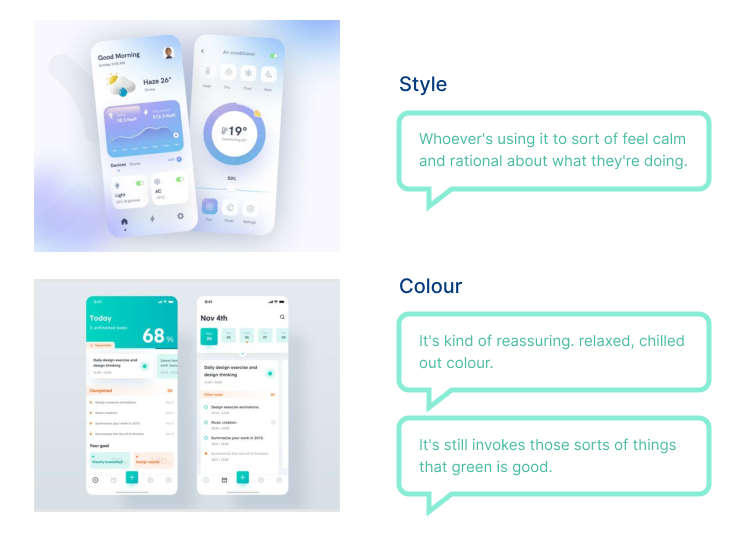
I examined multiple app designs with diverse styles and colors to ascertain their preferences, providing substantiation for my UI design choices.
However, the participants astonished me by expressing a desire for serene and tranquil visual elements while addressing loan matters, a consideration I had not previously contemplated.
Consequently, I was able to create a UI design that extended beyond individual preferences and aesthetics.

ITERATION
Refinition
I delete the features which negatively affect the experience.
Although the other features may efficient for the proposal, I think I could have improved the deleted ones and created a more innovative and positive journey.

Priority
As for the other features, I decided to focus on developing four of them which the participants value more.
I didn’t delete the reward feature because it still brought slight positive motivation for useers, and it also make the proposal more comprehensive. It is not necessary to delete it.

Design principle
About the principle, I revise them according to the real feelings from real users


Awards
Overall Winner – The Ford Motor Company Fund Smart Mobility Challenge 2022
- The Ford Motor Company Fund Smart Mobility Challenge invited teams of students to propose new ideas for sustainable urban solutions for communities.
- Overall winning team was funded £12500 to develop the service.
Bronze Prize – iCap International Design Workshop
- The workshop was held by the universities of Indonesia, Korea, Malaysia, and Taiwan, encouraging students to explore how technology can be used to improve human life.
- The competitors were over 100 students from Indonesia, Korea, Malaysia, and Taiwan
Experience
Reach User Experience Design Studio (Taiwan)
- Led a £9,960 research project for a startup company’s website redesign and service strategy. The proposal caused the appreciation of the company and continued the cooperation with the studio, which was worth £25,000.
- Established an initial internal client SOP for the studio, helping the owner understand the pros and cons of the studio and systematically introduce our value to new clients.
- Proposed a user flow and wireframe redesign of a website for Taiwan’s biggest international charity organization, and several of my wireframes were adopted. The whole project was £25,000.
Visionary Thinkers
Visionary Creators
Visionary Makers