
Final Project
Slang and Abbreviations
As the Internet age grows, more and more slang and abbreviations are appearing. Along with the development of a gradually abbreviated language, misunderstandings have arisen. This project explores what a language system is and designs fonts based on post-00s slang. The project also uses a photo app, which is used a lot nowadays, as an output vehicle and designs some special effects in detail. This app becomes a place to collect, spread and popularise slang by combining it with slang. I try to use this visual expression to help the audience better understand the meaning of different slang and abbreviations, thus alleviating the occurrence of misunderstandings.
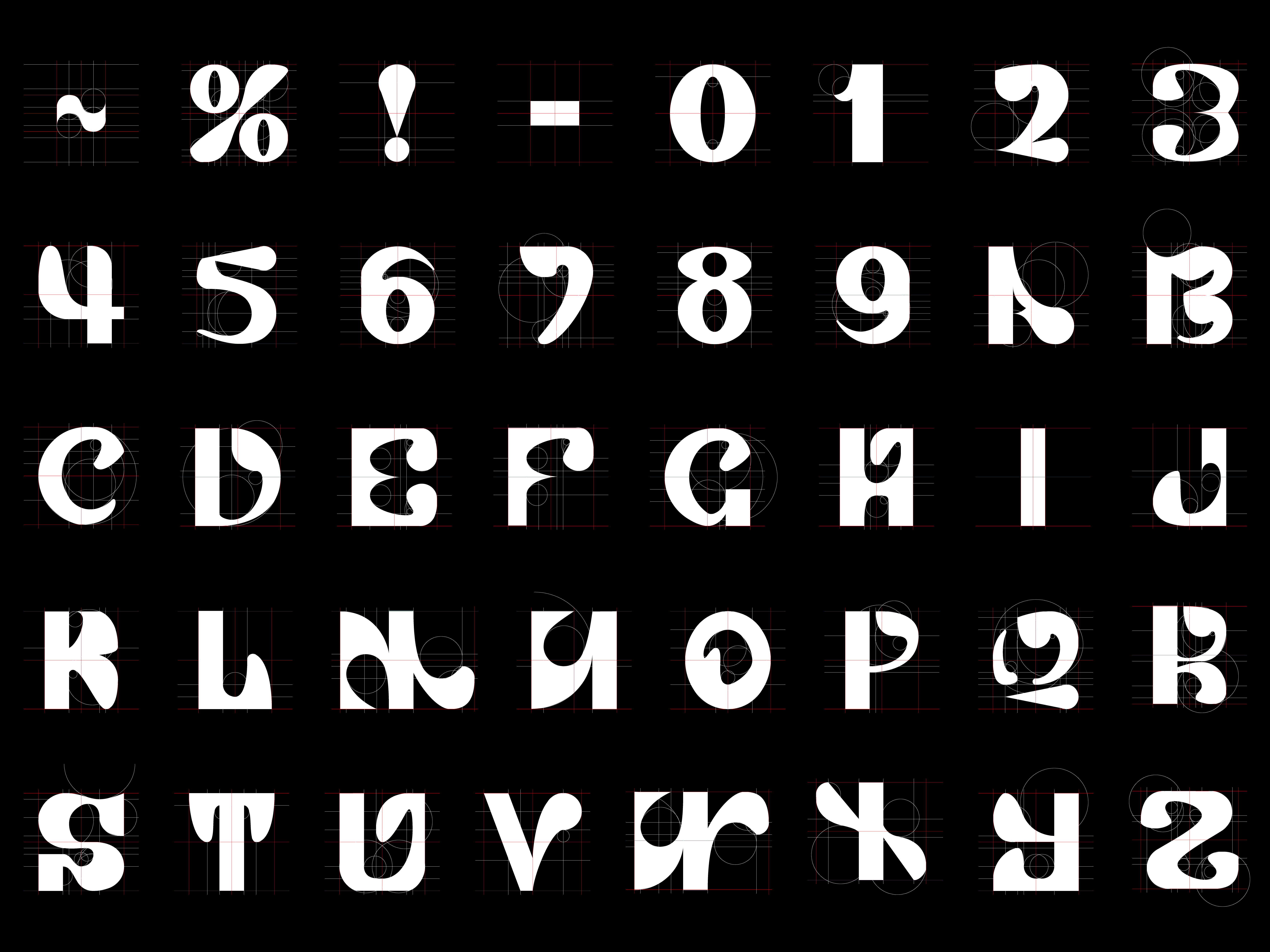
Typography
Based on the three main elements extracted earlier, combined with the user’s preferences and needs, I designed a new set of fonts containing 26 letters and some numbers and symbols. I want to make the audience better understand the meaning of different slang words through some visual representations, which has alleviated the misunderstanding problem mentioned in the questionnaire.
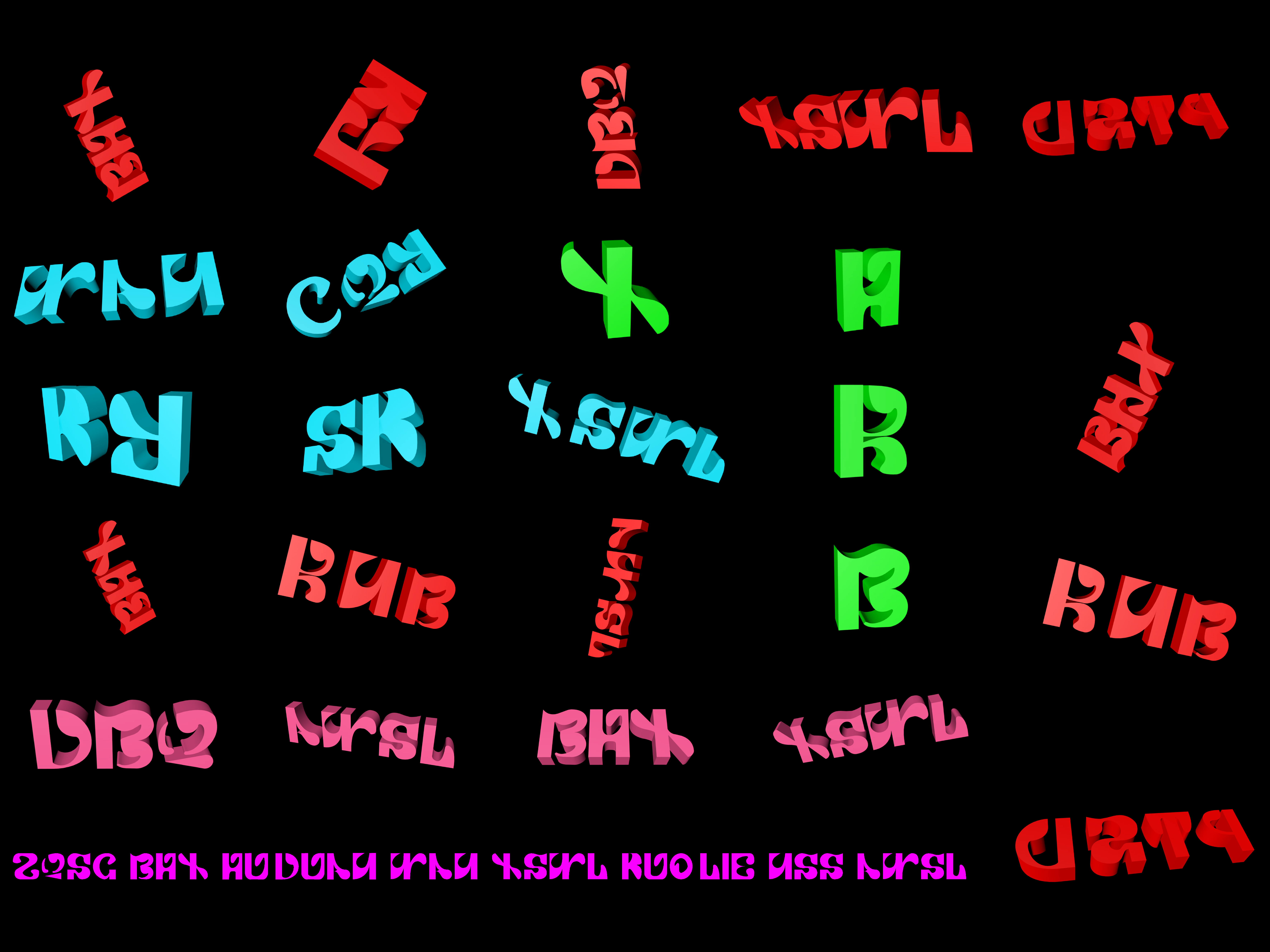
3D Fonts
I also made some 3D attempts, changing different angles and colors. The 3D design can strengthen the audience’s visual impact and leave a deep impression on them to better achieve the effect of understanding the slang.
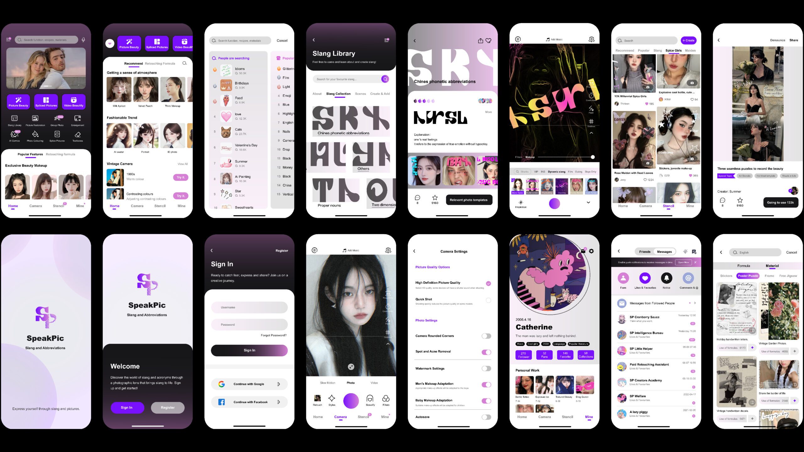
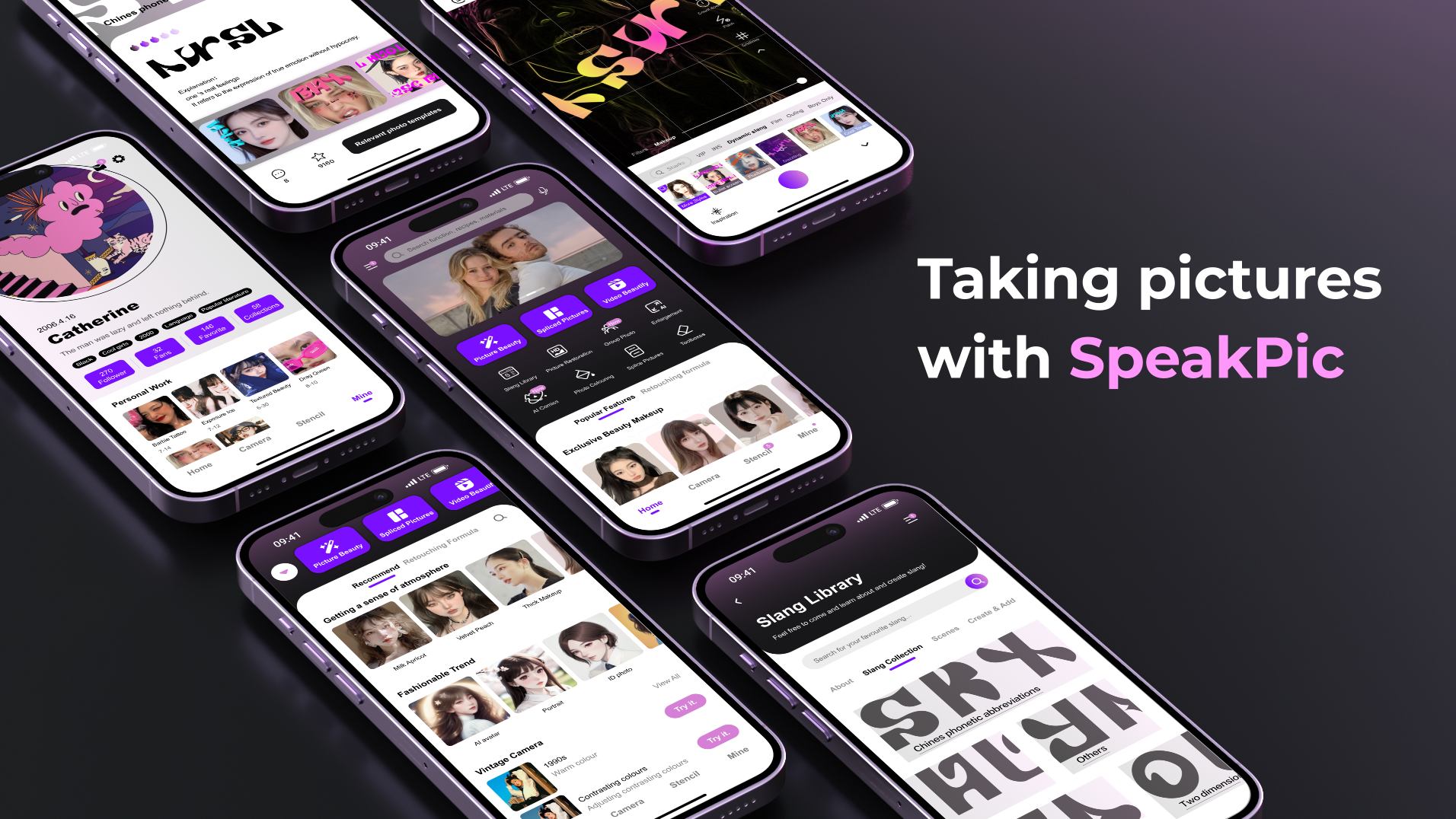
App Design
“SpeakPic”: The “Speak” in “SpeakPic” emphasizes the linguistic nature and expressive culture of the app, suggesting that users can communicate their words, feelings, and opinions through photos and images. “Pic” is an abbreviation for the picture, and combining the visual element with “Speak” presents the dual nature of the app, which combines photos with slang and abbreviations.
Video
This app becomes a place to collect, disseminate, and popularise slang by combining it with photos. I try to use such visual representations to help the audience better understand the meaning of different slang words and abbreviations, thus alleviating the occurrence of misunderstandings.
Other Work
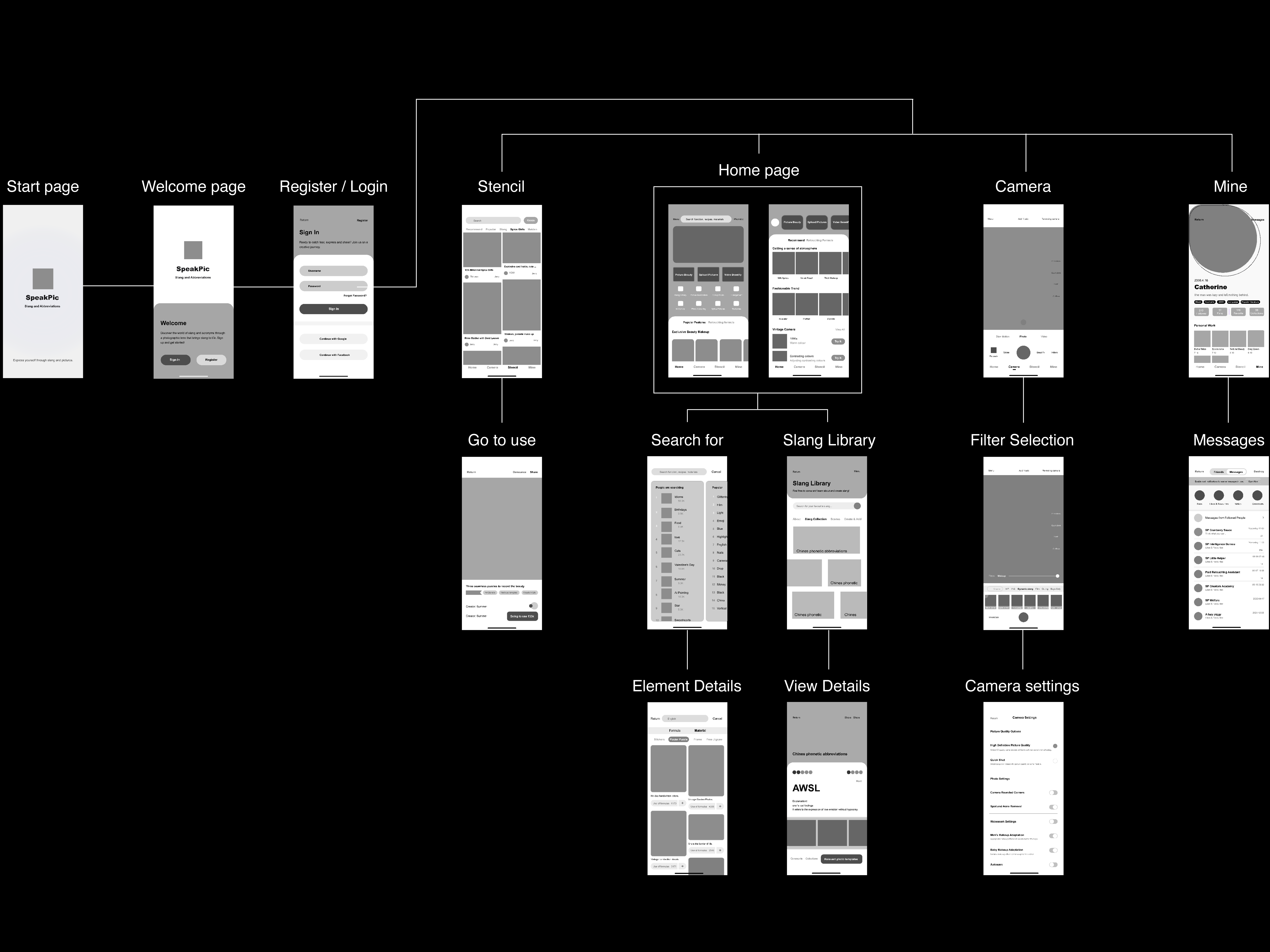
This wireframe focuses on the journey of using this app, from opening the app to template finding, from slang creation to photo taking, showing the approximate typography and layout of the interface of this app.
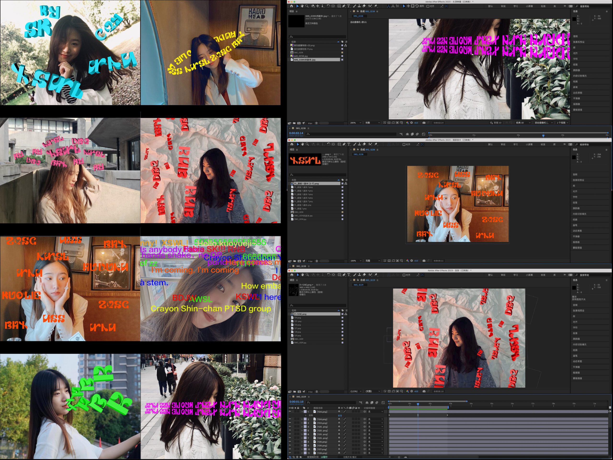
These are the filters and effects I used to simulate those found in photo apps using the fonts I designed combined with selfies. There are nine different effect styles designed in total, some of them are dynamic, so they are made into videos, so you can open the links to watch them.
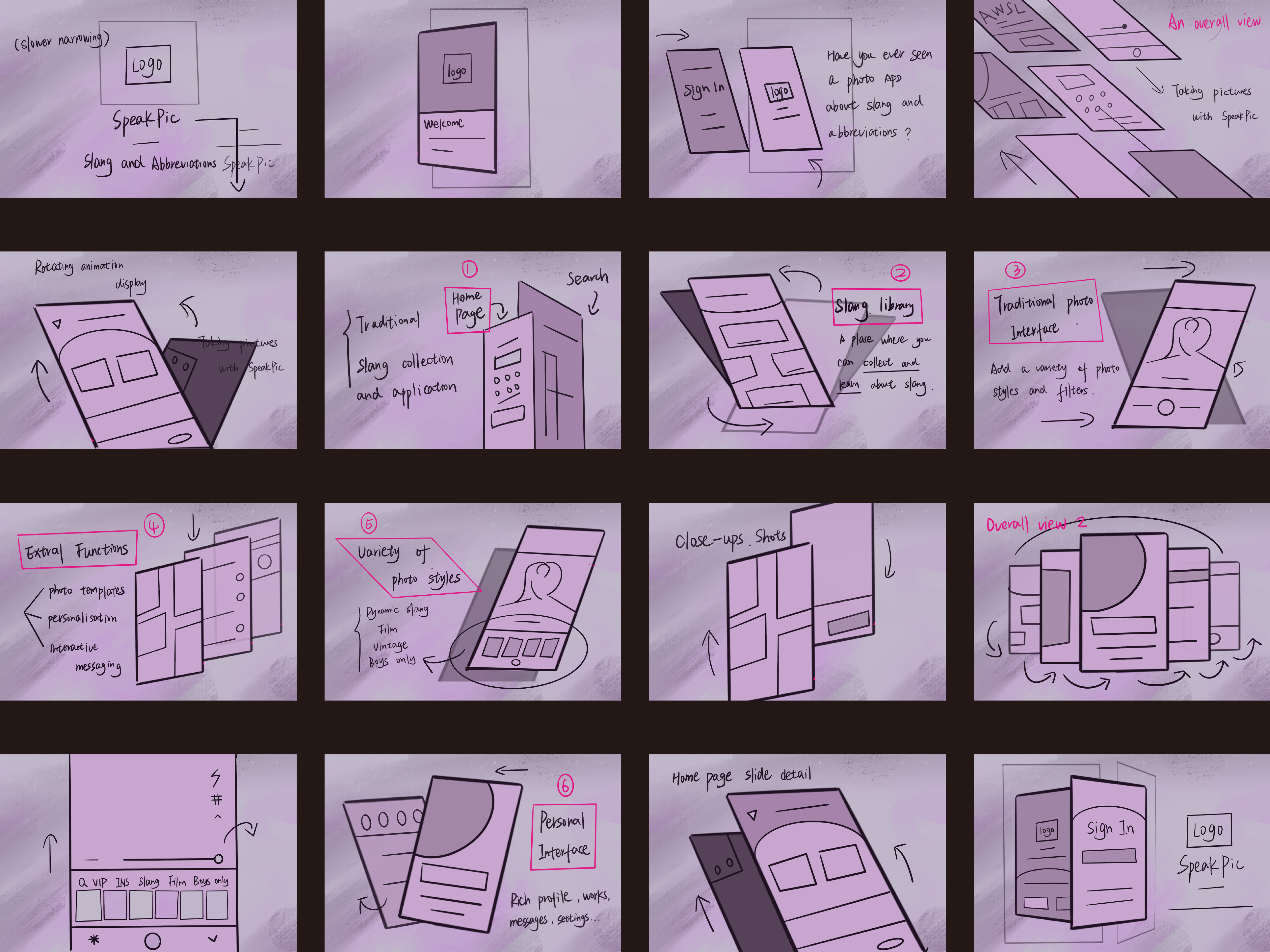
This is a video split sketch of the final result. The designed application interface will be displayed on a physical mobile phone and made into a video. The sketch contains a presentation of the complete interface, a description of the features and a rough idea of the animation.
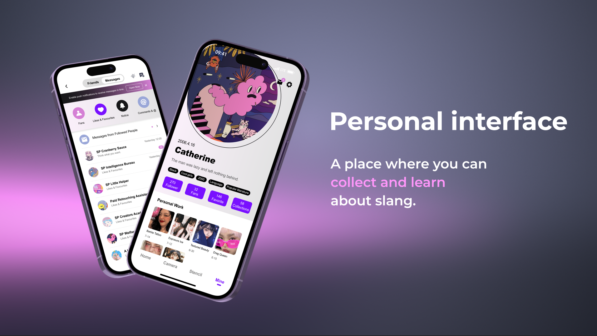
Personal Interface
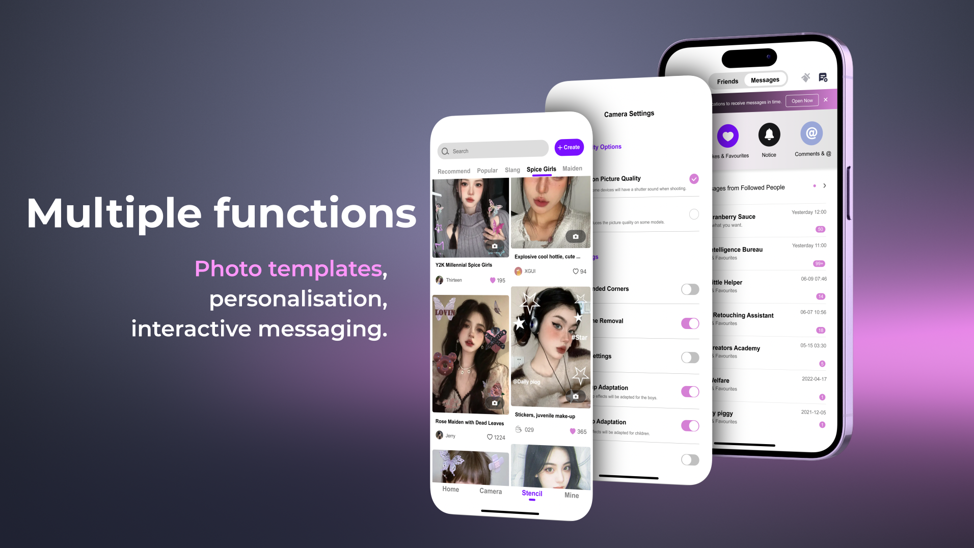
Multiple Functions
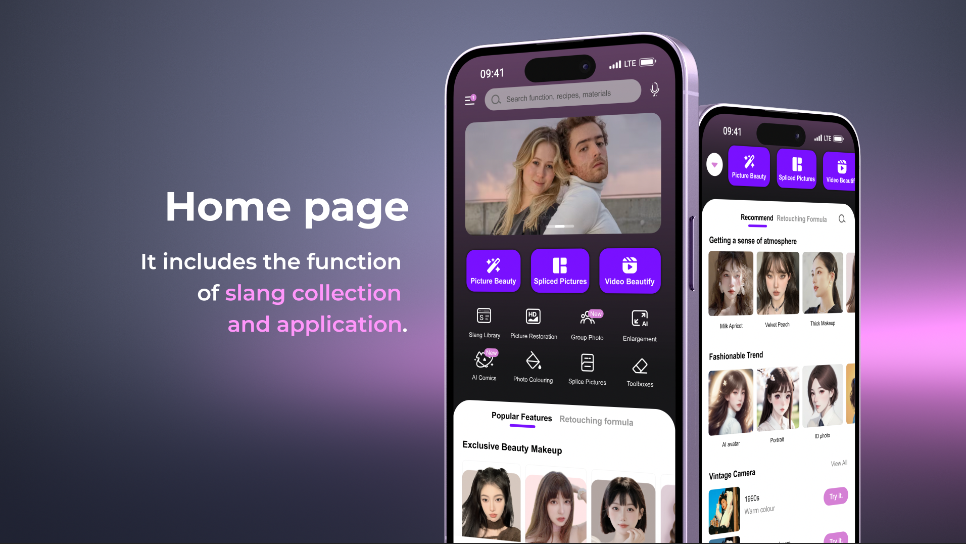
Home Page
Key Elements
- Chocolate cosmic flower
- PC code
- Three geometric shapes
Evaluation
Accessibility: Ensure that the application can be used by different audiences, including people with disabilities, by implementing appropriate accessibility features.
Educational elements: Incorporate educational elements into the app to inform users about the origins of different slang terms and help them better understand the various contexts.
Visionary Thinkers
Visionary Creators
Visionary Makers