
I’m a former Digital Marketer (seven years industry experience) turned User Experience Designer, and I take delight in creating engaging digital interactions at scale. I've shifted my conversion rate optimisation mindset to a user-centred design one.
Research Project:
What are the Psychological Factors Influencing Gen Z’s Brand Affinity Towards Luxury Brands in the Metaverse?
The aim of the project is to solve the problem that brands in the industry are facing,
‘Is the metaverse a worthwhile expenditure or a missed opportunity for brands?’
Context
Over the last several years, luxury brands have invested in the Metaverse for it’s novel customer engagement, and its ability for social interaction in an immersive branded VR experience.
Why The Metaverse?
- Large Investment in this Space
The Metaverse market value could soon reach trillions of dollars (www.mckinsey.com, 2022), and offers potential economic potential. - Gen Z: Build it, They Will Come
Fashion brands want to tap into the gaming industry of 3.2 billion gamers (who socialise online) to remain culturally relevant with this sizable market (CNN, 2022). - Companies Pulling from the Metaverse
Slow adoption of the platform has caused brands like Meta, Microsoft, Tencent and Disney to reduce in-house funding for Metaverse development (Pratt, 2022). - Difficult Campaign Success Measurement
Luxury brands are focused on brand awareness and engagement directed at those under twenty (Wongkitrungrueng and Suprawan, 2023)
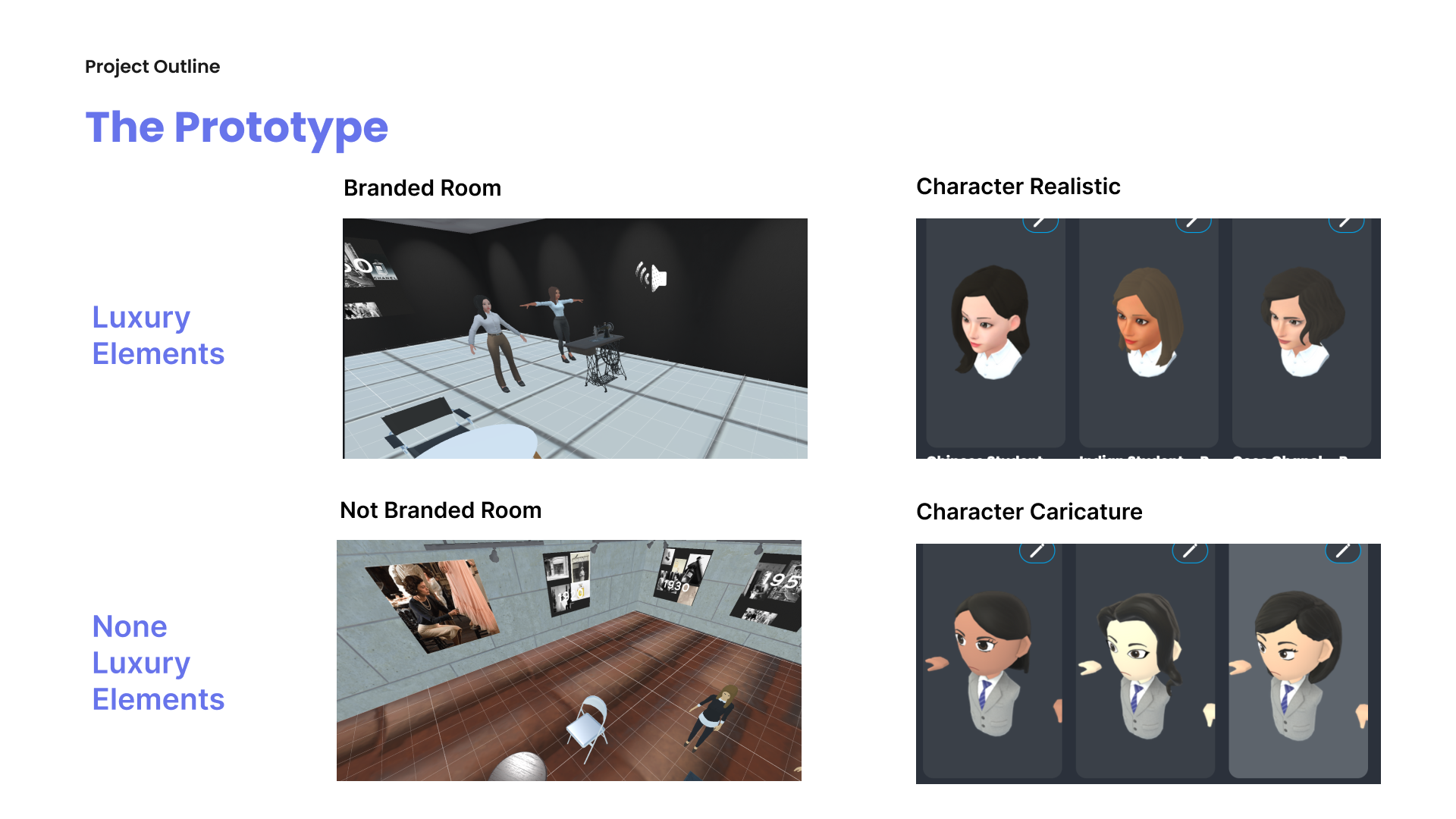
To fulfil the aim of the research project, numerous prototypes have been made to test the initial hypothesis, and a design thinking framework has been utilised to guide the project’s development.
Research Question
What is the effect, if any, of the application of semiotics and symbolism in virtual-enabled brand experiences on 1. perceived usability and
2. perceived brand affinity?
Objectives
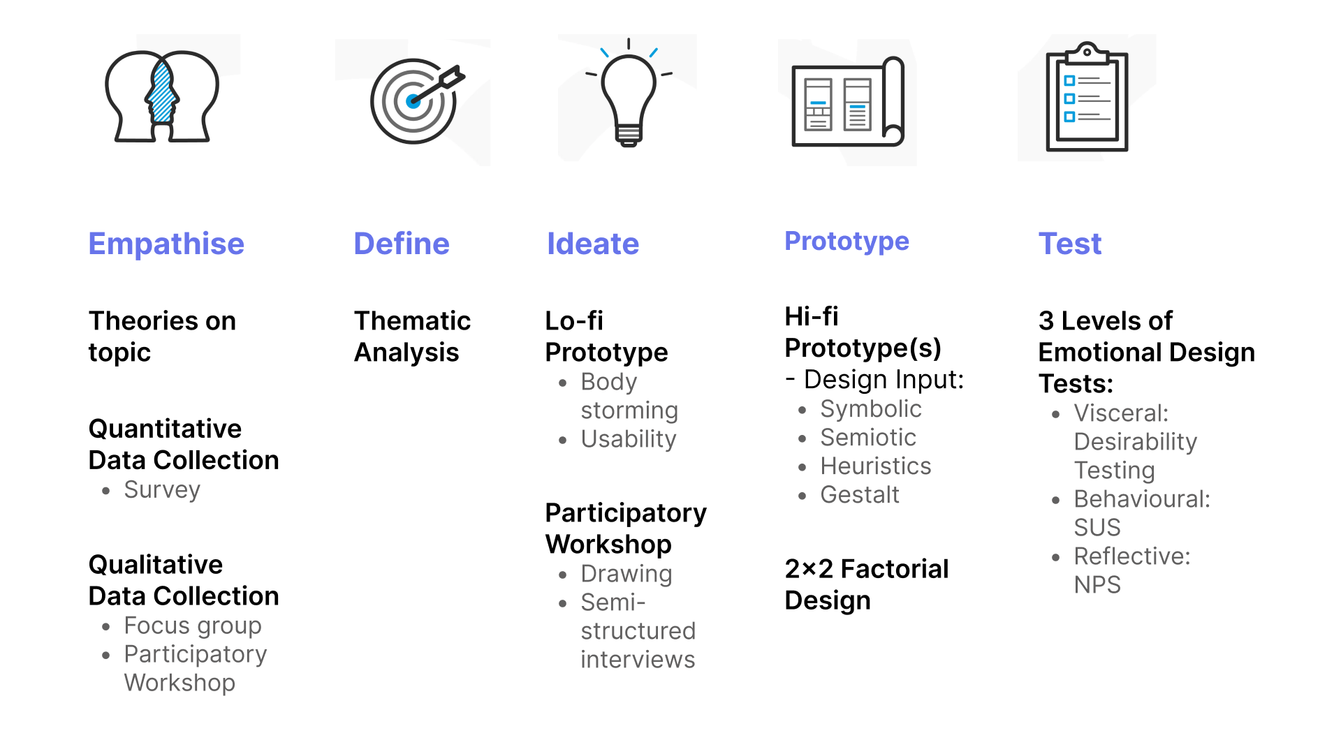
- An online questionnaire survey and a focus group aimed to understand user needs and requirements about VR, the Metaverse and luxury brands.
- A participatory workshop aimed to generate ideas of design concepts to help address the user needs of users.
- Application of UX design methods and techniques to generate prototypes that integrated the theory of semiotics with user requirements.
- A controlled user study to evaluate the effectiveness of the designed prototypes in terms of perceived usability and perceived brand affinity.
Project Development via Design Thinking Framework
The Design Thinking framework was used to construct the research development and design of the prototype used in this research. The nonlinear methodology effectively addressed the unknown problems (aka wicked problems) in regard to this new marketing platform. This process helped me understand the usability, desirability, feasibility, and viability of developing an advanced technologies (Metaverse and VR) marketing experience for Chanel.
Prototype Theories to Test for Impact on Brand Affinity
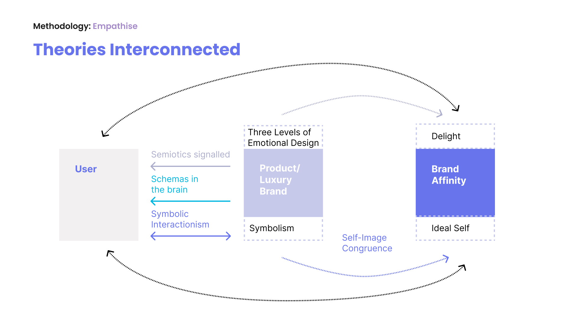
The theories were used to influence the design of the prototype and to help measure certain psychometrics – observed psychological constructs regarding the user’s brand affinity, an emotional connection that an individual has for a brand.
Symbolism
Transmits meaning among some groups and can be understood as a concept regarding an object, act, or situation. In addition, in the context of luxury brands, symbols can represent something of value and feed into an individual’s intrinsic and extrinsic value.
Symbolic Interactionism
This social theoretical framework believes meaning is derived from acts of everyday social interaction. Individuals construct symbolic and shared meaning through repetitive interaction in various social spaces.
Cognitive Semiotics
The shortest definition of this theory is the study of ‘visual signs’ and how we interpret visual signals through media and symbolic codes and conventions, which we understand through symbolic interactionism.
Emotional Design Framework to Determine Design Elements and Testing Methodologies
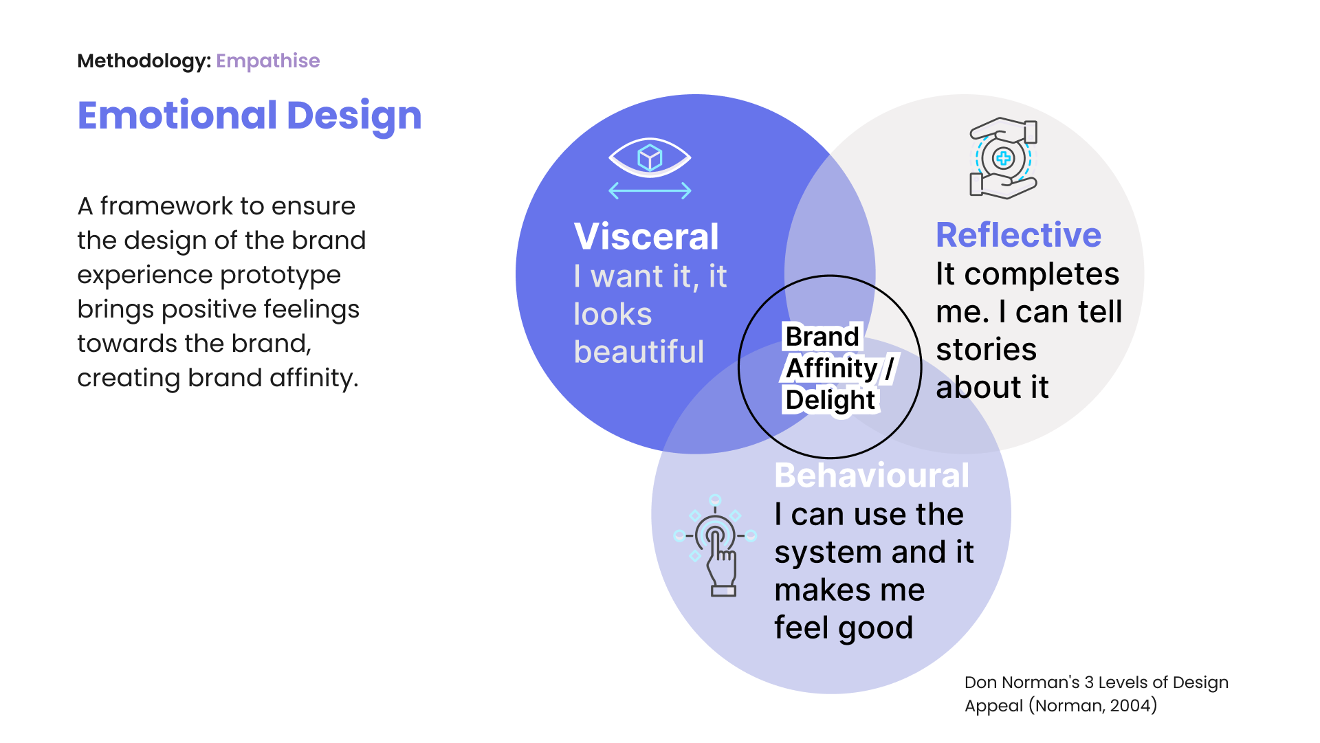
As brand affinity is concerned with the user’s feelings and emotions towards a brand, Don Norman’s Three Levels of Design (emotional and processing) considers how the user interprets stimuli from interacting with a product and processes the experience on three levels (1) Visceral, (2) Behavioural and (3) Reflective.
Level 1: Visceral Design
This level refers to the appearance, perceptible qualities, and how they make the user feel. This is often referred to as branding. This level will utilise the previous theories of Symbolism and Semiotics.
Level 2: Behavioural Design
This can also be referred to as usability and the pleasure and effectiveness of use, and how the product accommodates both skilled and inexperienced users, especially considering if participants do not have existing mental models of how-to use VR technology or navigate the Metaverse.
Level 3: Reflective Design
The highest level of emotional design represents the conscious thought layer, the rationalisation and intellectualisation of a product, and how the user forms an opinion on the product concerning self-image and if it would enhance their image.
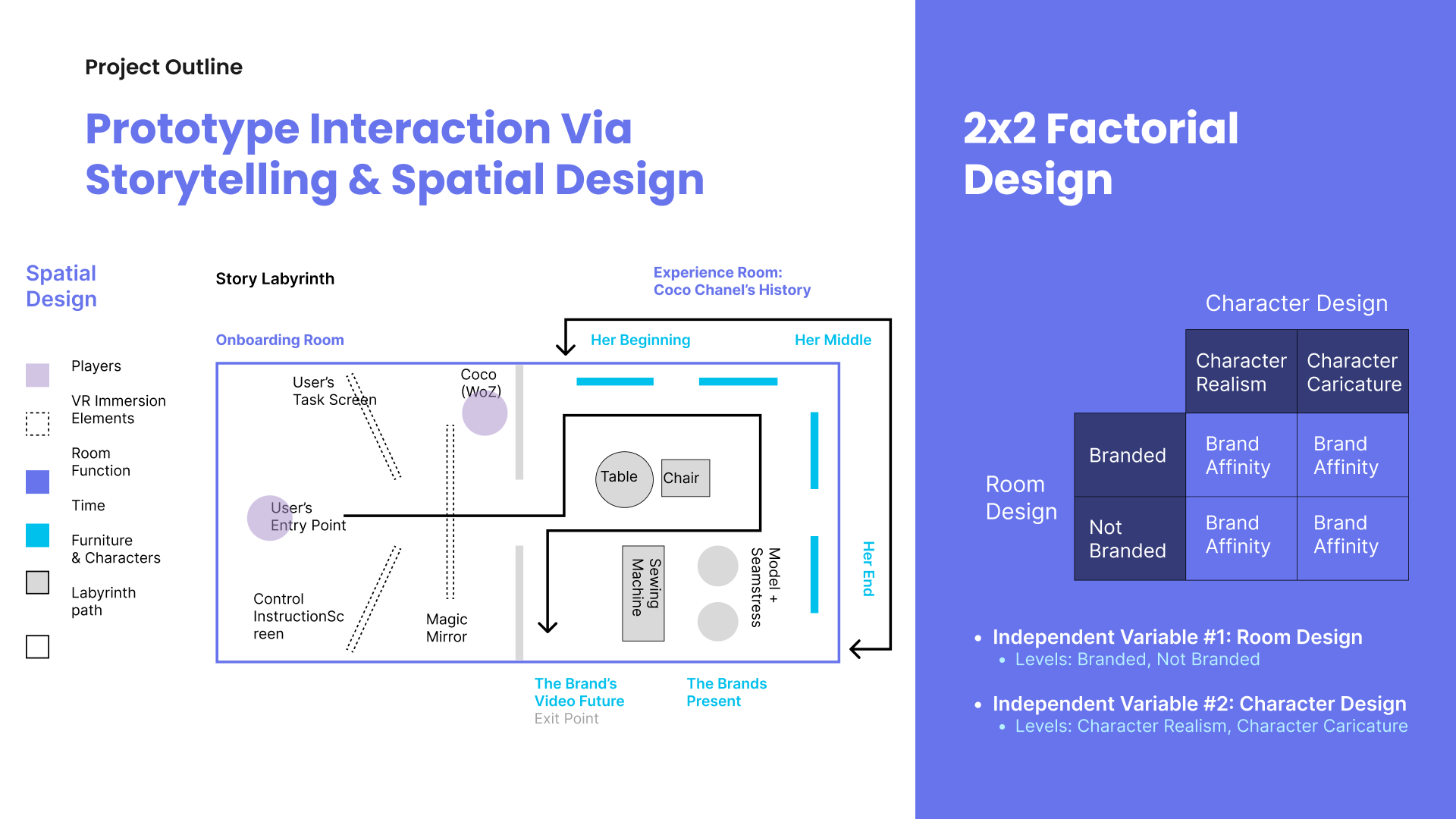
Determining the Experience and Design Factors for Prototype Testing
Luxury brands have an emphasis on brand heritage to help distinguish them from other brands, and they use storytelling to get these points across, and for the brand to help create their value and status, appeal to an individual’s self-image congruence.
By creating a predetermined path for the user, by progressively disclosing information about Coco Chanel’s beginning, middle and end of her time with Chanel, the user can digest, engage and query about the brand and the notable figure. In the user’s ‘hero journey’ through the spatial designed metaverse ‘labyrinth’, the user’s constraints and affordances are predetermined, as the level of interaction and customizable actions are limited, the interactive avatar will guide them through the space.
This way, the user’s needs for interactions are met in the low to high fidelity prototype testing stages, within the constraints of what’s technologically feasible for this project.
Using spatial design and allocating spaces in the VR Metaverse experience is crucial for the effective storytelling of luxury heritage brands. Using brand heritage for luxury brands is crucial to their marketing to create creditability, and focus group participants determined this was an essential factor they wanted to know about brands.
This helps build affinity with the user and signals symbolic features through symbolic interactionism.
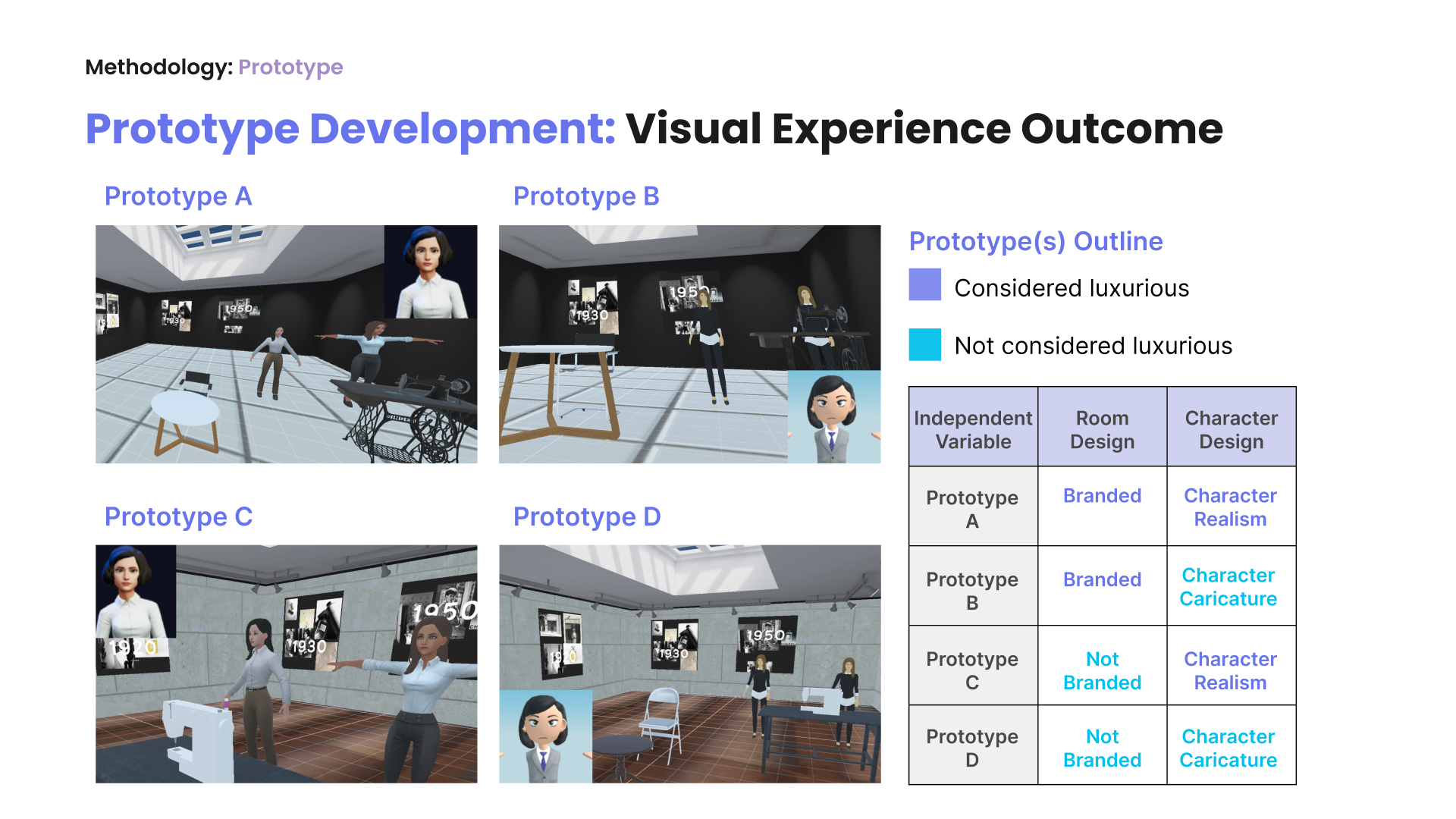
Visceral Level: Visual Design Treatments for Prototypes
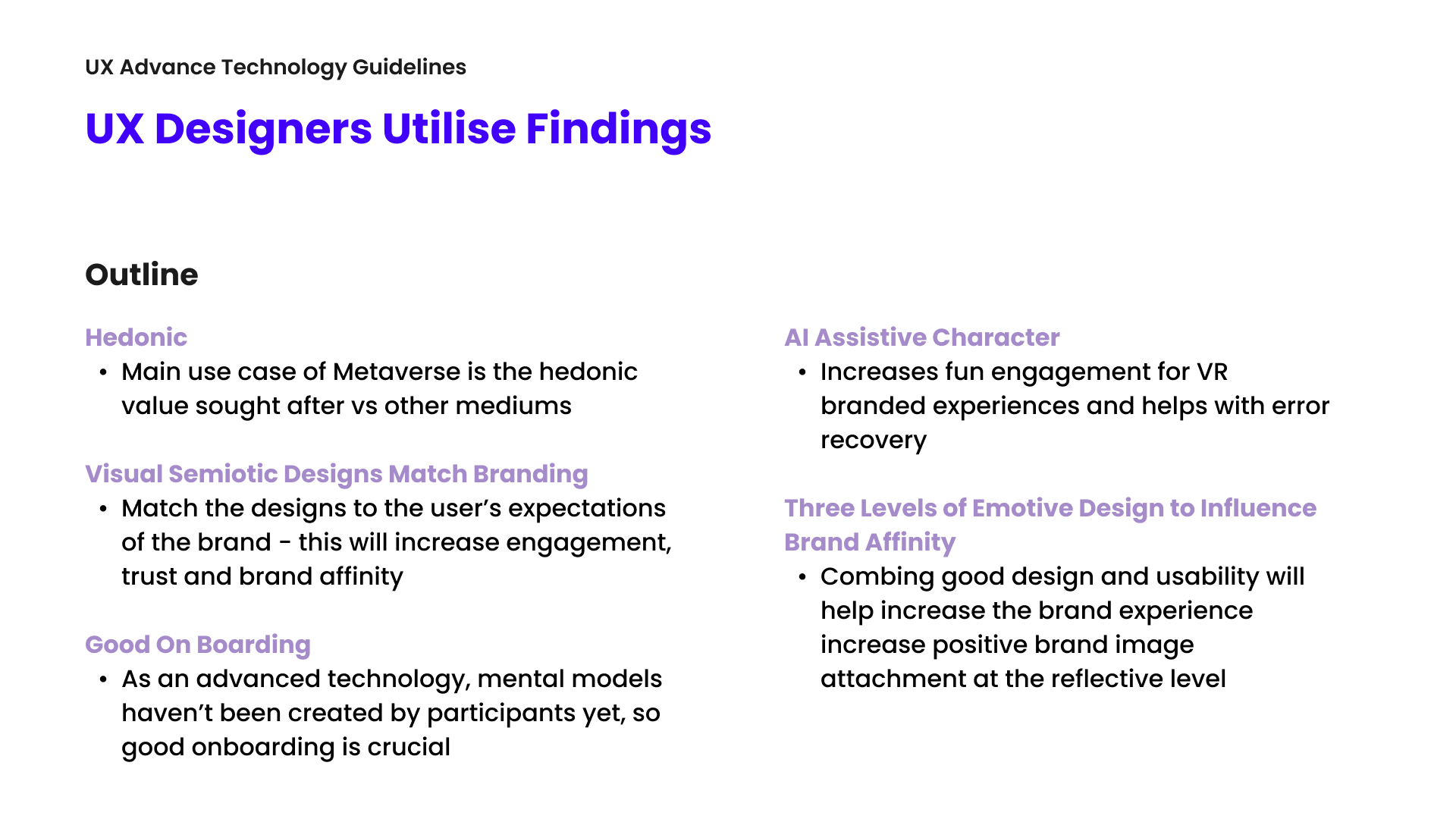
Based on data collected from participants during the empathise and ideate phases of the design thinking process, the below methodologies influenced the design of the VR prototype and which independent variables needed to be tested.
Focus Group
- Wants to find out more about brands
- History
- Quality
- Wants interactive elements
- Cartoon characters don’t look luxurious
Bodystorming
- The system and layout are straightforward
- Needs onboarding at the beginning
Participatory Workshop
- Use of symbolic figure giving the brand touch
- Luxury visual design semiotic elements and Chanel branding confirmed
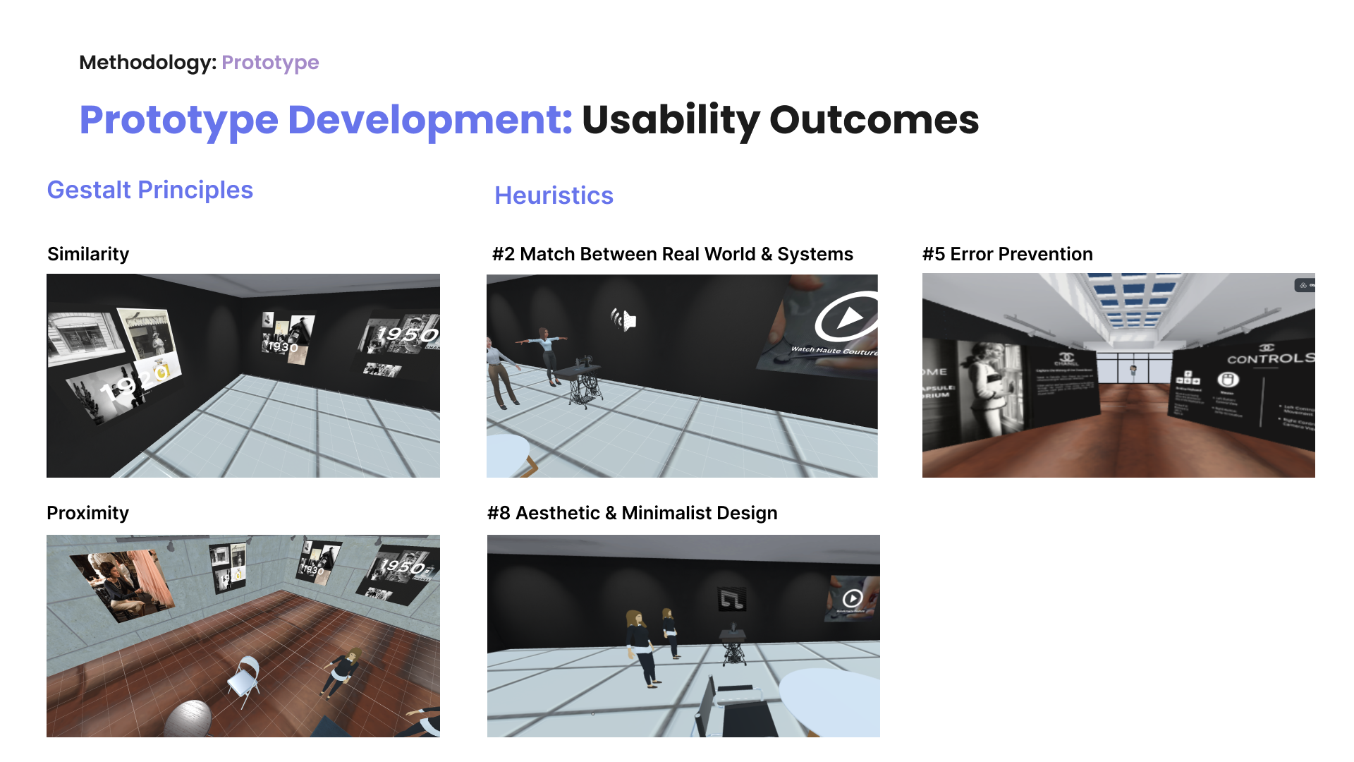
Behavioural Level: Designing for Advanced Technology Usability
Using visual design to signal system functions based on mental shortcuts.
Also, using psychology to influence the interaction design of the system.
Good usability of this new technology system is crucial and an essential pillar for emotive design level ‘behaviour’.
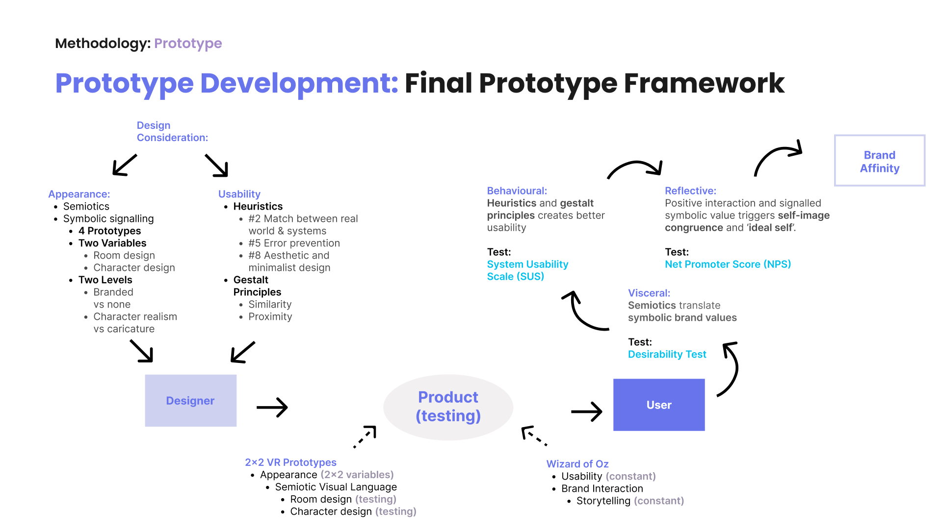
Visceral Level: Design Consideration Testing and Analysis
As the research has multiple prototypes, the within-subject design will measure the different design treatment outcomes.
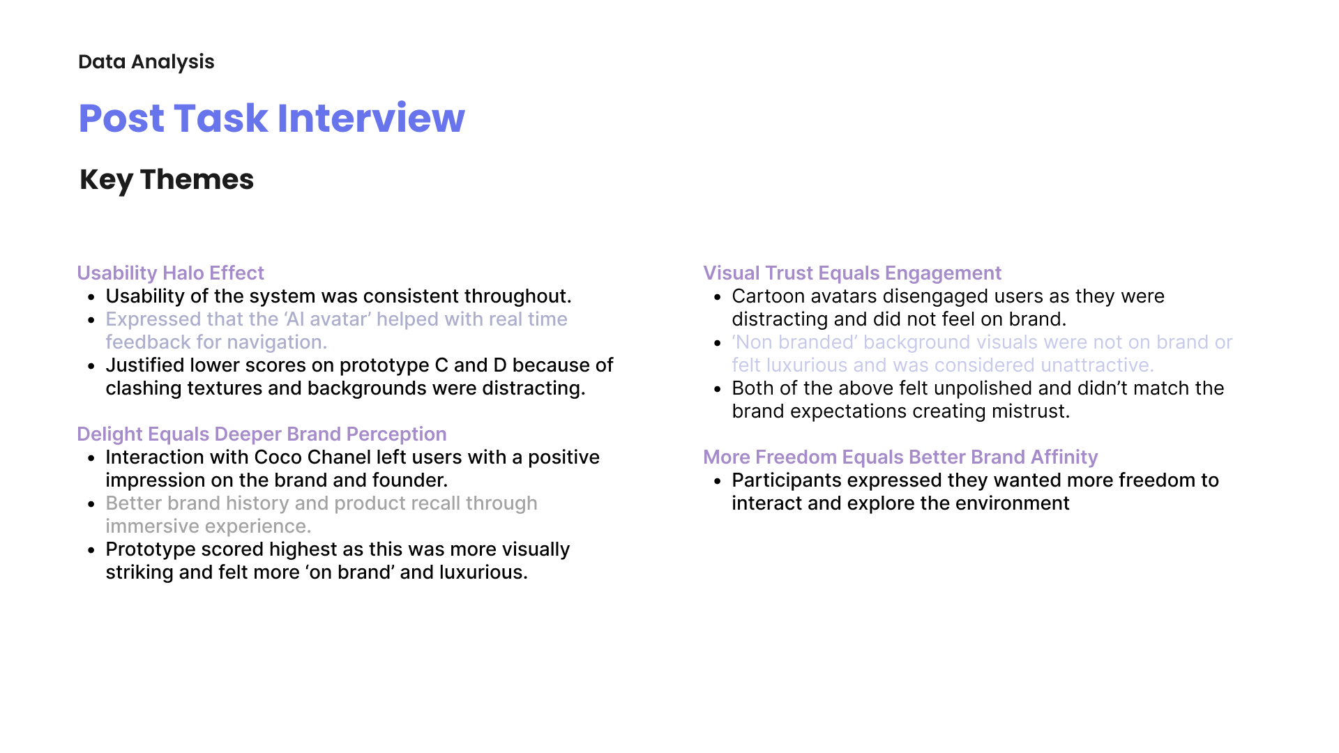
All the considerations around the visual design and usability elements will determine if, at the reflective level, the user will have a positive emotional attachment to a brand product or service, but in this branded VR experience. This emotional opinion of the experience will determine whether the user has a positive view of the brand, therefore creating affinity for the brand.
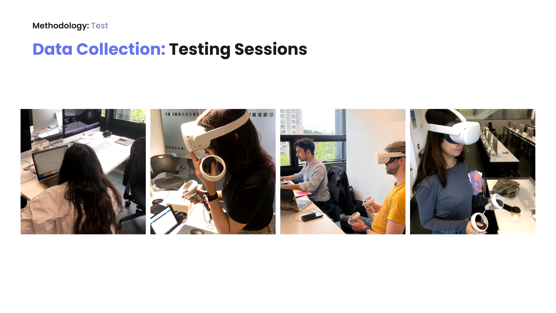
Outline of Testing Session
The controlled study randomly assigns participants into experimental or control groups. As two independent variable designs are being tested, this will become a 2×2 factorial design (two within-subject factors).
Participants were given VR headsets to enter one of the four prototype room variations based on their partial counterbalanced sequencing. Once the participants entered the virtual room, they had to read the two onboarding graphic posters. As VR is still considered a new advanced technology, which many haven’t experienced before, the onboarding instructions are crucial to ensure that non-familiar users can navigate the platform.
Whilst the participant read the task instructions and game controller guide, the researcher logged into the VR room disguised as Coco Chanel. The participants had to speak to Coco in the VR brand experience room and learn more about the brand and her past with it. The facilitator guided participants around the room and narrated her time with the brand.
After the participant interacted with each prototyped room (A, B, C, and D), participants had to fill out questionnaires for both SUS and NPS across all the designs, and semi-structured interviews followed this.
As there are four prototype treatments, a partial counterbalanced measure has been used to control progressive error for each individual subject by presenting the different treatment conditions more than once. This block randomization technique effectively reduces the learning transfer effect.
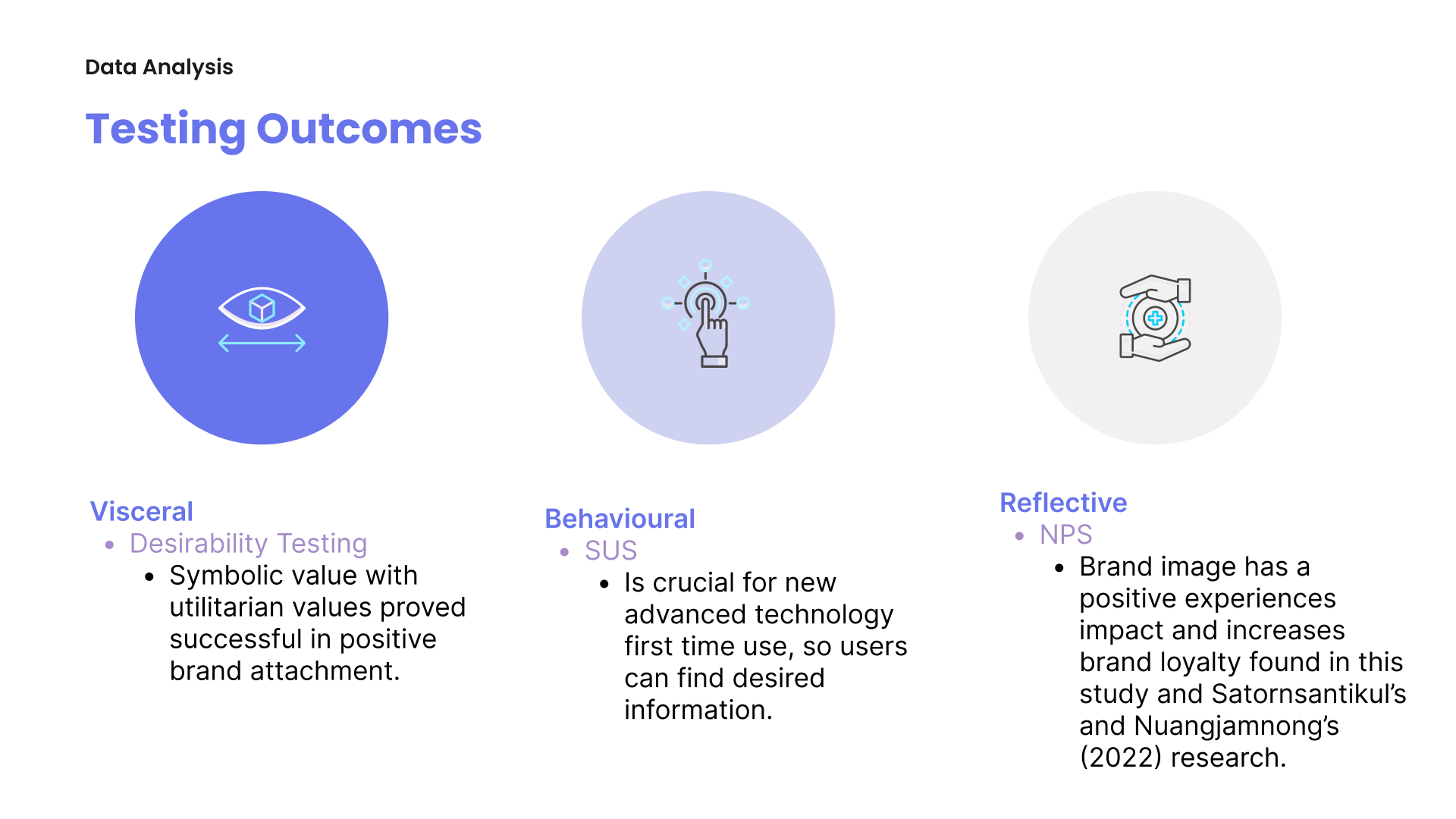
Emotional Design Testing Outcomes to Determine Brand Affinity
Desirability Test
To analyse the most frequently selected descriptive words for each prototype, frequency, and percentages, descriptive analysis is used to report on the designs’ most common visual interpretation (semiotic) and whether they’re considered luxurious (symbolic).
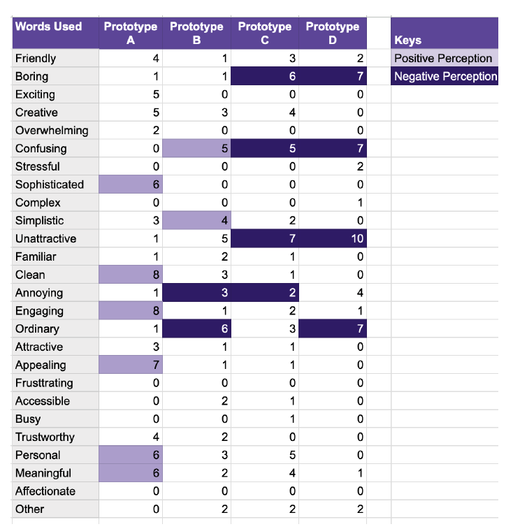
Interestingly, Prototype A has the highest frequency of positive words, compared to Prototype B, which has a mixed use of positive and negative words. Prototype C and D only have high percentages of negative words used.
62.5% of participants viewed Prototype D as unattractive, in comparison to A (6.25%), B (31.25%) and C (43.75%). In contrast, only 18.75% described prototype A as 18.75% attractive, compared to both B and C as 6.25%, with no one calling prototype D attractive. This shows that participants feel more strongly about the unattractive attributes of the prototypes instead of having attractive qualities.
SUS
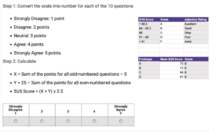
An SUS score formula in Excel was used to determine each individual’s perceived usability responses for prototypes A, B, C and D. Individually, the results are determined if the usability is good; they score above 68 (considered the average SUS score).
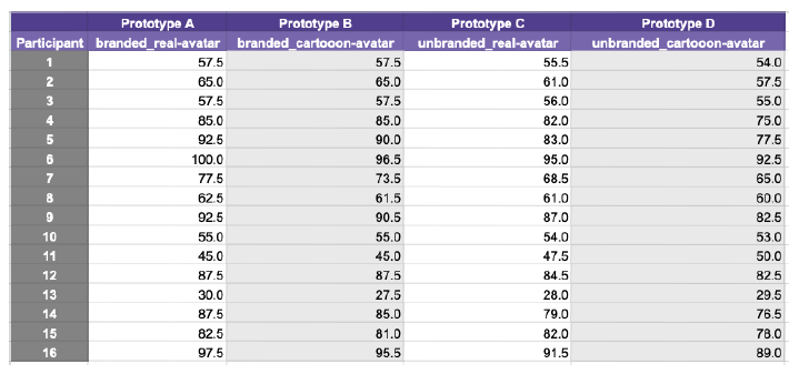
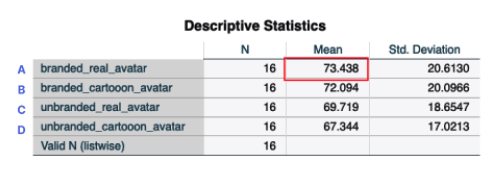
All the prototype variations scored B, despite a gradual decline in the SUS scores from prototypes A to B, which indicates good usability of the system. Considering this is an advanced medium that most users aren’t familiar with, the onboarding screens helped with usability initially and didn’t hinder the other dependent test results.
NPS
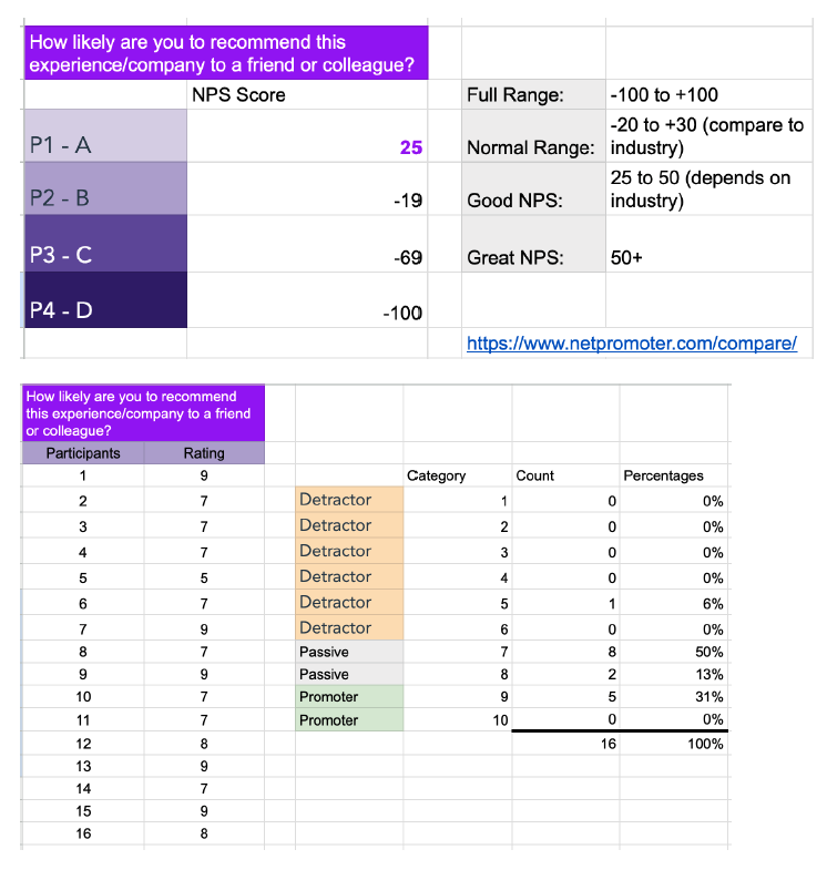
Prototype A is the only prototype that meets the criteria of a ‘Good NPS’, whereas all the other prototypes failed the industry standard test, indicating those design variations displeased the participants and that they wouldn’t recommend those particular experiences to a friend.
Visionary Thinkers
Visionary Creators
Visionary Makers